Dive into the Future: Top Website Design Trends for 2024
In today’s digital landscape, your website is more than just an online storefront or virtual brochure – it’s your brand ambassador, your storyteller, and your gateway to connecting with your audience.
In a world where attention spans are shrinking and competition is fierce, having a website that’s not only functional but also visually appealing and engaging is no longer optional, it’s essential.
But the world of web design is a constantly evolving one. Trends shift, technologies emerge, and user expectations change at a rapid pace. What was cutting-edge yesterday can feel dated today, and what works for one industry might not translate well to another. That’s why staying ahead of the curve and embracing the latest design trends is crucial for keeping your website fresh, relevant, and effective.
So, buckle up and get ready to dive into the exciting world of website design trends for 2024!
1. Immersion and Personalization
Remember the days of static websites that were little more than online brochures?
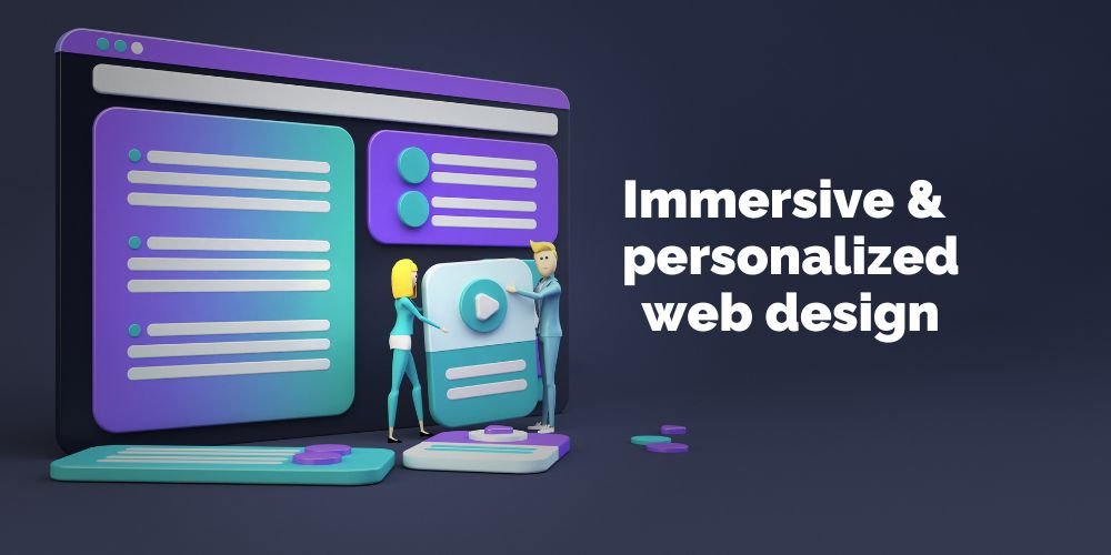
Those days are fading fast, replaced by a new wave of web design that prioritizes immersion and personalization, transforming websites from passive viewing experiences into dynamic journeys tailored to each individual user.
This shift reflects a fundamental change in how we interact with the digital world. We’re no longer content with simply consuming information; we crave engagement, interactivity, and a sense of connection. Websites that cater to this desire are seeing phenomenal success, forging deeper relationships with their audiences and driving real results.
But how are these immersive and personalized experiences being created? At the heart of this revolution lie powerful technologies like artificial intelligence (AI) and machine learning (ML). These tools are allowing websites to:
- Understand user preferences and behaviors: By analyzing user data, websites can build detailed profiles of their visitors. This allows them to tailor content, recommendations, and even the overall layout of the site to each individual’s preferences, creating a truly unique experience.
- Deliver dynamic content: Gone are the days of one-size-fits-all content. AI-powered websites can dynamically adjust content based on user context, location, and past interactions. Imagine a travel website suggesting personalized itineraries based on your interests and travel history, or an e-commerce platform showcasing products you’re more likely to be interested in.
- Create interactive experiences: Interactive elements like quizzes, polls, and games can capture user attention and make the experience more engaging. AI can further personalize these interactions, adapting them to the user’s level of knowledge and preferences, making them both enjoyable and informative.
- Offer conversational interfaces: Chatbots powered by AI and natural language processing (NLP) are becoming increasingly sophisticated, allowing users to interact with websites in a natural, conversational way. This can be a game-changer for customer service, product inquiries, and even personalized product recommendations.
Examples of websites using these technologies effectively:
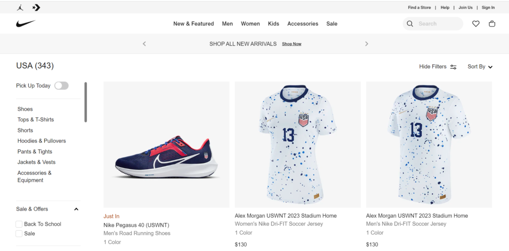
- Nike: Nike’s website uses AI to personalize product recommendations based on a user’s browsing history and past purchases. They also offer a “Your Nike” section where users can create personalized experiences like customized shoes and training plans.
- Netflix: Netflix leverages AI to personalize its recommendations for each user, ensuring they discover content they’re likely to enjoy. They also use A/B testing to optimize the user interface and overall experience for different segments of their audience.
- Sephora: Sephora’s Virtual Artist tool uses AI and augmented reality to allow users to virtually try on makeup before they buy it. This personalized and interactive experience has been a major success for the beauty brand.
The possibilities for immersive and personalized experiences on the web are endless.
As AI and ML technologies continue to evolve, we can expect to see even more innovative and engaging websites that captivate users, build deeper connections, and ultimately drive better business results.
So, are you ready to take your website from passive to immersive? The future of web design is here, and it’s all about creating experiences that truly resonate with each individual user.
2. Digital Maximalism
For years, minimalism reigned supreme in the world of web design. Clean lines, muted colors, and white space were the order of the day. But as trends evolve and user preferences shift, a daring new aesthetic is emerging: digital maximalism.
Think of it as the antithesis of minimalism. Digital maximalism throws open the doors to a world of bold colors, vibrant textures, playful patterns, and dynamic micro-interactions. It’s a rejection of restraint and a celebration of expressive, immersive experiences.
Key characteristics of digital maximalist websites:
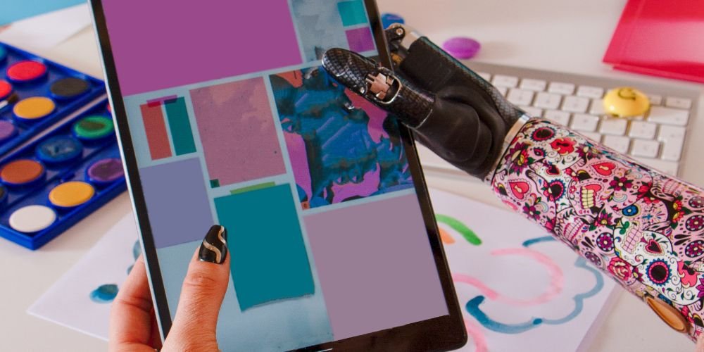
- A feast for the eyes: Gone are the days of subtle color palettes. Digital maximalism embraces bold, contrasting colors that create a visually stimulating experience. Think electric blues juxtaposed with fiery oranges, or deep purples clashing with vibrant greens.
[Image of Digital maximalist website design with bold colors] - Texture galore: Smooth and flat are out, rough and textured are in. Digital maximalist websites incorporate a variety of textures, from gritty concrete to soft fur, adding depth and dimension to the design.
[Image of Digital maximalist website design with textures] - Pattern power: Stripes, polka dots, florals, geometrics – you name it, digital maximalism embraces it. Patterns are used to create visual interest, add rhythm, and break up the monotony of plain backgrounds.
[Image of Digital maximalist website design with patterns] - Micro-interactions that delight: Subtle animations, hover effects, and interactive elements add a layer of playfulness and engagement to digital maximalist websites. These micro-interactions can be anything from a button that changes color when you hover over it to an animation that unfolds when you scroll down the page.
Why digital maximalism works:
In a world increasingly dominated by digital experiences, standing out from the crowd is crucial. Digital maximalism achieves this by being bold, unexpected, and memorable. It captures attention, sparks curiosity, and invites users to explore and interact with the website in a deeper way.
Here are some of the benefits of using digital maximalism:
- Increased engagement: The visually stimulating nature of digital maximalist websites can lead to increased user engagement, as users are more likely to spend time exploring and interacting with the content.
- Enhanced brand personality: Digital maximalism allows brands to express their unique personality and values in a creative and impactful way.
- Memorable experiences: Websites that embrace digital maximalism are more likely to be memorable and leave a lasting impression on users.
Is digital maximalism right for you?
Digital maximalism isn’t for everyone. It can be a risky approach, as it’s important to strike a balance between bold and overwhelming.
If your brand is playful, creative, and not afraid to break the rules, then digital maximalism might be a suitable choice but if your brand leans more toward elegance and sophistication, minimalism may still be a better choice.
Ultimately, the decision of whether or not to embrace digital maximalism depends on your specific brand, target audience, and overall goals. But if you’re looking to create a website that’s truly unique, engaging, and unforgettable, then this audacious trend is definitely worth considering.
3. Handmade Illustrations
In the realm of web design, where pixels and vectors often reign supreme, a charming counter-trend is blossoming: the resurgence of handmade illustrations.
These imperfect strokes, textured lines, and bursts of color are breathing fresh air into websites, adding a touch of personality, warmth, and uniqueness that digital graphics sometimes lack.
But why are handmade illustrations gaining traction?
The answer lies in their inherent human touch. In a world saturated with digital perfection, these illustrations stand out with their authenticity and expressiveness. They convey a sense of emotion, whimsy, and storytelling that can resonate deeply with users, fostering a closer connection with your brand.

The magic of handmade illustrations:
- Personality infusion: Handmade illustrations allow you to inject your brand’s unique personality into your website. Whether it’s playful and quirky, sophisticated and elegant, or anything in between, these illustrations can visually communicate your brand’s essence in a way that text alone cannot.
- Emotional connection: The imperfections and nuances of handmade illustrations evoke a sense of warmth and approachability, making your website feel more welcoming and relatable to users. This emotional connection can foster trust and loyalty with your audience.
- Stand out from the crowd: In a sea of websites that often look homogenized, handmade illustrations can help you stand out from the competition. They add a touch of uniqueness and originality that will grab users’ attention and leave a lasting impression.
Tips for using handmade illustrations effectively:
- Find the right style: Choose an illustration style that aligns with your brand identity and target audience. Consider factors like color palette, linework, and overall mood to ensure the illustrations complement your brand’s aesthetic.
- Quality matters: While handmade illustrations embrace imperfection, that doesn’t mean they should be unprofessional. Invest in high-quality illustrations that are well-composed and visually appealing.
- Use them strategically: Don’t overload your website with illustrations. Use them intentionally to highlight key information, break up text, and add visual interest to specific sections.
- Consider animation: Adding subtle animations to your illustrations can make them even more engaging and dynamic, further enhancing the user experience.
- Showcase the artist: If you’re commissioning an artist for your illustrations, consider giving them a credit or bio on your website. This personal touch can add value and connect your audience with the creative talent behind the artwork.
By embracing the beauty of handmade illustrations, you can breathe new life into your website, forge deeper connections with your audience, and leave a lasting impression that sets you apart from the crowd.
So, grab your metaphorical paintbrush, unleash your creativity, and let the art of imperfection weave its magic into your web design!
4. Clear and Visible Borders
In the ever-evolving world of web design, where trends ebb and flow like digital tides, one element has stood the test of time: the humble border.
Often overlooked, clear and visible borders play a crucial role in website clarity, structure, and user experience. They act as visual guides, separating sections, highlighting content, and enhancing overall readability.

Why borders matter:
- Clarity and organization: Borders create well-defined boundaries between different sections of your website, making it easier for users to scan, understand, and navigate the content. Think of them as guideposts on a roadmap, directing users towards their desired information with ease.
[Image of Website design with clear and visible borders] - Improved hierarchy and focus: By using borders strategically, you can establish a visual hierarchy on your website, guiding users’ attention to the most important elements. For example, a thicker border around a call-to-action button can draw the eye and encourage user interaction.
- Enhanced readability: Borders can help to separate text from its background, making it easier for users to read and comprehend your content. This is especially beneficial for websites with complex layouts or a lot of text content.
- Accessibility: Clear borders can improve the accessibility of your website for users with visual impairments. The increased contrast between different sections can make it easier for them to navigate and understand the content.
Tips for using borders effectively:
- Choose the right color and weight: The color and weight of your borders should complement your overall website design. Generally, opt for colors that contrast well with the background and avoid overly thick borders that can overwhelm the content.
- Use them strategically: Don’t go overboard with borders. Use them sparingly and intentionally to highlight key sections and elements. Overusing borders can create a cluttered and visually overwhelming experience.
- Match the style to your brand: The style of your borders should align with your brand identity. For example, a playful brand might use whimsical dotted borders, while a more sophisticated brand might opt for clean and minimalist lines.
- Consider responsiveness: Ensure your borders adapt and adjust properly on different screen sizes and devices. This is crucial for maintaining a consistent and positive user experience across all platforms.
By incorporating clear and visible borders into your web design, you can create a clearer, more organized, and user-friendly website.
These subtle design elements can have a significant impact on how users interact with your content and navigate your online space. So, don’t underestimate the power of the border – embrace its potential and watch your website flourish!
Other Hot Website Design Trends for 2024
While we’ve delved into some of the most exciting website design trends for 2024, the digital landscape is brimming with even more innovative approaches waiting to be explored.
Here’s a quick peek at a few other notable trends that are poised to make waves in the coming year:
1. 3D Design and Animation

Buckle up for a dive into the immersive world of 3D! Websites are increasingly incorporating 3D elements, from captivating animations to interactive product visualizations. This technology adds depth, dynamism, and a touch of wow-factor to user experiences. Want to learn more? Check out these articles:
- The Rise of 3D Web Design: Trends and Best Practices: https://www.designveloper.com/en/blog/web-design-trends/
- How to Use 3D Animation in Web Design: https://css-tricks.com/tag/3d/
2. Microinteractions
The smallest details can make the biggest impact. Microinteractions are subtle animations and visual cues that add a layer of delight and engagement to user interactions. From hover effects to loading animations, these tiny moments can leave a lasting impression. Dive deeper into the world of microinteractions with these resources:
- Microinteractions: Delightful Details That Improve User Experience: https://uxdesign.cc/micro-interactions-why-when-and-how-to-use-them-to-boost-the-ux-17094b3baaa0
- A Comprehensive Guide to Microinteractions in Web Design: https://alistapart.com/blog/topic/css/
3. Voice User Interfaces (VUIs)

The rise of smart speakers and virtual assistants has ushered in a new era of voice-controlled interaction. Websites are increasingly incorporating VUIs, allowing users to navigate, search, and access information using their voice. Explore the potential of VUIs with these articles:
- The Future of Web Design is Voice-Activated: https://www.nngroup.com/articles/voice-interfaces-assessing-the-potential/
- Designing for Voice: Best Practices for a Seamless VUI Experience: https://medium.com/geekculture/voice-user-interface-bots-ca0ce1f40e95
4. Sustainable Web Design
As environmental consciousness grows, so too does the focus on sustainable web design practices. This involves optimizing websites for efficiency, reducing their carbon footprint, and using renewable energy sources. Learn more about building a greener web with these resources:
- Sustainable Web Design: A Guide to Eco-Friendly Websites: https://www.websitecarbon.com/
- The Green Grid: Web Performance Best Practices for Sustainability: https://www.thegreengrid.org/
Remember, these are just a few of the many exciting trends shaping the future of web design. Stay curious, keep exploring, and embrace the ever-evolving landscape of the digital world to create websites that are not only beautiful and functional, but also innovative and engaging for your audience.
Conclusion
As we’ve explored in this article, the world of web design is a dynamic and ever-evolving space. From the immersive experiences of AI-powered personalization to the bold statements of digital maximalism, the trends we’ve discussed offer a glimpse into the exciting possibilities that lie ahead in 2024.
Remember, these trends are not meant to be prescriptive rules, but rather sources of inspiration and experimentation.
The key is to find the trends that resonate with your brand identity and target audience, and use them to create a website that is not only visually appealing but also functional, engaging, and future-proof.
So, as you embark on your web design journey in 2024, here are some key takeaways to keep in mind:
- Embrace immersion and personalization: Leverage the power of AI and ML to create dynamic and user-centric experiences that cater to individual preferences and behaviors.
- Explore digital maximalism: Don’t be afraid to experiment with bold colors, textures, patterns, and micro-interactions to create visually stimulating and engaging experiences.
- Incorporate handmade illustrations: Add a touch of warmth, personality, and uniqueness to your website with the charm of handmade illustrations.
- Utilize clear and visible borders: Enhance the clarity, structure, and readability of your website by using well-defined borders to separate sections and highlight key elements.
- Stay informed about emerging trends: Keep your finger on the pulse of the latest web design trends by exploring industry publications, attending conferences, and following design thought leaders.
- Experiment and have fun: Don’t be afraid to step outside your comfort zone and try new design ideas. The most innovative and successful websites often emerge from a spirit of experimentation and creativity.
By embracing these trends and staying curious about the ever-evolving world of web design, you can create a website that not only stands out from the crowd but also delivers exceptional value to your audience.
Ready to take your website to the next level?
If you’re looking for help navigating the latest web design trends and creating a website that truly reflects your brand and resonates with your audience, I’d love to hear from you.
Contact us today to discuss your web design needs and explore how we can help you bring your vision to life.
In the meantime, be sure to subscribe to our blog for regular updates on the latest web design trends, insights, and tips. Let’s continue this exciting journey of web design exploration together!
